Here's the uncomfortable truth: Your website looks fantastic on a 27-inch monitor, featuring a stunning hero image and well-chosen brand colours that possibly earned your marketing agency a design award.
That’s all good, but it's quietly burning $12,000–$16,000 of your monthly ad spend.
We've audited dozens of Australian law firms, healthcare practices, and finance brokers spending $20,000+ per month on paid acquisition. The pattern is clear and consistent: beautiful, brand-driven websites that convert qualified traffic at 2–3%, when comparable practices with less impressive designs routinely hit 7–12%.
The maths are brutal. At $20,000/month, generating 2,000 clicks, a 2% conversion rate delivers 40 enquiries. The same traffic at 10% will gain 200 enquiries. This is the difference between struggling to justify the media spend and having your intake team flat out managing qualified leads.
Let's be clear: this isn't about traffic volume. If you're spending $20k+/month, you're almost certainly generating thousands of monthly visits. What’s holding you back is what happens after the click, and for Australian professional services, that constraint is almost always user experience, not audience size.
The Benchmarks That Expose the Problem
An average business website converts around 2.35% of visitors into enquiries or actions. That's the baseline, and, yes, it's pretty bad.
Professional services should perform better. Legal landing pages, for instance, hit 6.3% median conversion, with top performers reaching 13.1%. Financial services average 8.3%, with industry leaders exceeding a mighty 26.1%.
Far from Silicon Valley unicorn hype, the data represents median benchmarks for Australia and comparable markets.
Yet when we audit firms spending serious money on Google Ads, Meta campaigns, and display ads, we consistently find conversion rates of 1.5-3%. The gap between actual performance and realistic benchmarks represents tens of thousands of dollars in wasted spend every single month.
Things don’t look so bright either when we look at the mobile picture. In Australia, roughly 61.4% of traffic comes through mobile devices, yet mobile conversion rates are approximately half of those on desktop. For many practices, most of the expensive clicks are going to a site that converts at about half the rate of desktop, and no one notices because, well, let’s face it, it looks good.
What does this mean in practice: a Sydney personal injury firm spending $25,000/month on Google Ads generates 2,500 clicks. At a 2.5% mobile conversion rate and 61.4% mobile traffic, they're getting roughly 38 mobile enquiries. If they fixed mobile UX to match even conservative benchmarks (say, 6% for legal landing pages), that same traffic would generate 92 mobile enquiries, an additional 54 qualified leads per month from the same budget.
We’re not talking theory here. These are just straightforward funnel calculations applied to actual Australian benchmarks.
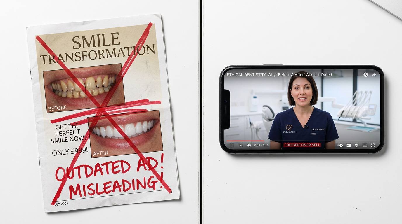
The 'Beautiful' Website Trap
Let's address the elephant in the room: most partners and principals judge website designs on aesthetics, brand alignment, and how impressive they look in boardroom presentations. That's completely understandable. You're investing a significant amount of money, and you want something that reflects the quality of your practice.
The problem is that the design elements that make a site look premium often actively lower conversion rates.
Here's what we see repeatedly:
Full-width hero images with abstract brand messaging
- Stunning to look at, but terrible for conversion rates.
- When someone searches for ‘no win no fee car accident lawyer Sydney’, they need immediate reassurance that they’re in the right place.
- A sweeping image with a tagline like ‘Excellence in Legal Service’ creates cognitive friction, forcing users to work out whether the page will give them the answers they need.
Complex navigation and multiple calls to action (CTAs)
- Premium websites often feature mega-menus showcasing every service.
- While this helps brand awareness, for paid landing pages, it’s a commercial disaster.
- Every extra menu item or secondary CTA is an exit point, diluting your primary conversion goal.
Slider carousels on the homepage
- Sliders are almost always terrible for conversion.
- Users rarely wait for slides to rotate or click through multiple slides to find key information.
- Your most important message gets buried, with 90% of visitors never engaging.
Mobile experiences that are scaled-down desktop designs
- This is one of the most expensive mistakes a law firm website can make.
- Three-column desktop layouts become vertical scroll marathons on a mobile device.
- Hero text may be illegible on small screens, and CTAs can get pushed far below the fold.
For users on mobile, ‘below the fold’ might mean three or four full-screen scrolls, killing conversion opportunities.
The irony is that partners often prefer these designs precisely because they look sophisticated and ‘high-end’. And they do, on desktop, in a presentation, when you're not actually trying to convert a qualified lead who's comparing three practices simultaneously on their phone.
We've rebuilt sites for Melbourne legal practices where the old site won design awards and the new site looks, frankly, more basic. Believe it or not, conversion rates tripled. The partners initially hated the new design, but they loved it after the first month's reports came in.
Where Your $20k+/Month Actually Leaks
Understanding the specific failure points in your funnel is critical because not all UX problems have equal commercial impact.
Leak Point 1: Ad to Landing Page Mismatch
You're paying for clicks on highly specific search terms or ad copy. ‘Bulk billing GP new patients Bondi Junction.’ ‘Income protection claims Brisbane.’ ‘Conveyancing fixed fee Melbourne.’
Then the click lands on a generic practice area page or, worse, your homepage.
The user's mental model is simple: they searched for something specific, they clicked an ad that promised something specific, and they expected the landing page to immediately confirm that specificity. When it doesn't, when they land on a page with a generic hero image, a broad practice description, and no immediate connection to what they actually searched for, a significant percentage bounce within seconds and they’re straight back to square one.
We routinely see 30–50% of mobile users exit before meaningful engagement when there's a message mismatch, particularly on slower-loading sites. Think of it this way: this is money you’re paying out that is generating zero value.
The fix is conceptually simple but requires discipline: dedicated landing pages for each significant intent cluster, with headlines and opening copy that directly mirror the ad and search term. Not ‘Our Family Law Services’ as a headline when someone searched ‘divorce lawyer cost Sydney.’ Instead: ‘Sydney Divorce Lawyers – Fixed Fee for Initial Consultation.’
This might feel repetitive and overly specific to partners reviewing the pages, but it’s perfect for the user who just clicked your ad.
Leak Point 2: Weak or Buried Calls to Action
Here's a test: open your main service pages on your phone. Scroll to where a first-time visitor would naturally stop reading. Can you see a clear, tappable call to action without scrolling further?
For most sites, the answer is no. The CTA is either buried at the bottom of a long page, hidden in a navigation menu, or presented as one of several equal options (‘Learn More,’ ‘Download Guide,’ ‘Book Consult,’ ‘Call Us’).
In professional services, particularly for high-intent paid traffic, there should be one primary action, and it should be impossible to miss. For urgent matters, personal injury, emergency dental, urgent medical appointments, and time-sensitive insurance claims, that action should be persistent (sticky header or footer) and mobile-optimised (large tap target, click-to-call).
We've seen 20–40% enquiry rate increases from nothing more than adding a sticky ‘Book Free Consult’ or ‘Call Now’ bar to mobile pages for urgent legal and healthcare matters. The content didn't change. The offer didn't change. It was the visibility and ease of action that changed.
Leak Point 3: Form Friction vs. Qualification Balance
This is where conventional wisdom often fails professional services.
The standard CRO advice is ‘shorter forms convert better.’ That's true in aggregate. It's often wrong for law, health, and finance.
Here's why: an extremely short form (name, email, phone) maximises submissions. But in high-value, complex services, it also maximises enquiries that are not worth your time. Your intake team ends up spending hours on calls with people who aren't in your service area, can't afford your fees, or bring you issues you don't handle.
The most profitable firms we work with use strategic friction. They keep qualification questions that filter for good-fit leads: matter type, location, urgency, approximate claim value or budget. Yes, this reduces raw form submissions, but it dramatically increases the percentage of submissions that become paying clients.
The key is how you implement this friction. A single-page form with 12 fields feels intimidating. A two-step form works best. The first step collects basic contact details and two or three qualification questions, while the second step gathers detailed compliance or intake information. This approach converts significantly better while still qualifying leads.
For finance and insurance, where regulatory requirements demand extensive disclosure and data collection, this two-step approach often increases Step 1 submissions by 30%+ compared to a single long form. This works because users aren’t faced with the full compliance requirements all at once.
Leak Point 4: Missing or Weak Trust Signals
Australian consumers, particularly in regulated professional services, are highly attuned to legitimacy and local presence.
Yet many ‘beautiful’ websites bury the trust indicators that actually drive conversion: local address and phone number, ABN, professional registrations (AHPRA numbers, Law Society membership, AFSL/ACL numbers, AFCA membership), Google reviews, and case outcomes or client testimonials (where permitted by regulators).
These elements often don't fit the aesthetic vision of a premium brand site. They feel ‘cluttered’ or ‘too salesy’ to designers. But their absence creates doubt, particularly on mobile, where users can't easily navigate to an ‘About’ page to verify credentials.
Displaying clear local contact information and local presence can increase conversion rates by up to 25% for Australian SMBs. For professional services, where trust is the primary barrier to engagement, this effect is even more pronounced.
The regulatory constraints in legal, healthcare, and finance don't prevent strong trust architecture – they just require thoughtful implementation.
- Legal websites (Sydney lawyers, Law Society regulations)
- Cannot claim to be ‘the best lawyer in Sydney’ or make misleading statements.
- Can display Law Society membership, years of practice, case results (appropriately framed), and client reviews.
- Healthcare websites (AHPRA regulations)
- Cannot guarantee medical outcomes.
- Can show AHPRA registration, specialist qualifications, clinic accreditations, and patient testimonials (within guidelines).
- Financial services websites (ASIC regulations)
- Cannot provide personal financial advice without proper licensing.
- Can display AFSL number, AFCA membership, and a transparent fee structure.
Key takeaway: Regulatory constraints don’t block strong trust signals. They just require thoughtful implementation to ensure credibility while staying compliant. The firms that convert well in these sectors understand that compliance and persuasion aren't opposites – they're complementary when the information is presented correctly.
The Mobile Experience Is Where Your Money Goes
Let's return to the core problem: roughly 61% of your paid traffic arrives on mobile, and mobile converts at roughly half the rate of desktop.
This is the primary commercial constraint for most Australian professional services running significant paid acquisition.
The mobile problems we see most frequently:
Slow load times. Three seconds feels fast on a desktop with fibre. On a mobile network, particularly in areas with variable coverage, three seconds is an eternity. A significant percentage of users will abandon before your hero image even renders. Every additional second of load time can reduce conversions by 7% or more.
Unreadable text and tiny tap targets. Body copy at 14px that's readable on desktop becomes a squint test on mobile. CTA buttons sized for mouse cursors become frustrating tap targets for thumbs. Forms with small input fields and tight spacing create friction that desktop users never experience.
Navigation that obscures content. Hamburger menus that work fine on desktop often hide critical information on mobile. Sticky headers that take up 20% of a small screen push your actual content and CTAs further down. Pop-ups and chat widgets that are unobtrusive on desktop can completely block mobile content.
No mobile-specific CTAs. The single highest-ROI mobile optimisation for urgent professional services is often a persistent click-to-call button. On the desktop, users might fill a form or browse multiple pages. On mobile, particularly for urgent matters, many users just want to call immediately. If that action requires navigating to a contact page and manually dialling, you're losing conversions.
The reality: fixing mobile UX is often the single highest-ROI project available to firms spending $20k+/month on acquisition. Not new ad creative. Not expanded keyword targeting. Not another landing page test. Fixing the experience that 61% of your expensive clicks actually encounter.
We've seen Brisbane healthcare practices increase new patient bookings by 35% from the same ad spend by doing nothing except rebuilding their mobile experience: faster load, simplified navigation, prominent online booking CTA, and streamlined intake forms optimised for mobile completion.
The Intake Workflow Gap
Againm this is where many Australian practices leave serious money on the table: they optimise the website to generate enquiries, then handle those enquiries with manual, unstructured processes that convert poorly.
Recent Australian legal industry data shows that firms implementing proper intake tools, online scheduling, digital intake forms, and e-signatures see revenue increases of 20–53%. That's not from generating more leads. That's from converting more of the leads they already have into paying clients.
The pattern is consistent across law, healthcare, and finance:
No online booking. Users fill out a form or call, then wait for someone to call back. In that gap, they're also contacting your competitors. The practice that lets them book immediately, seeing available times and confirming on the spot, has a massive advantage.
Manual intake processes. Phone tag to collect information that could be gathered via a structured online form. Email back-and-forth to send and return documents that could be e-signed. Each additional friction point is an opportunity for the lead to go cold or choose a competitor.
Slow response times. The data on this is clear: leads contacted within five minutes are significantly more likely to convert than leads contacted within an hour. Yet many practices treat web enquiries as something that can be left until the following day rather than urgent follow-up priorities.
The firms that systematically outperform in lead-to-client conversion aren't necessarily better at legal work, medical care, or financial advice. They're better at removing friction from the intake process.
For a practice spending $20,000/month to generate leads, investing $5,000–$10,000 in proper intake infrastructure (online booking integration, structured intake forms, e-signature capability, CRM with automated follow-up) typically pays for itself within weeks through improved conversion rates.
Sadly, most partners under-invest here because it's not visible in the same way a website redesign is. The intake workflow isn't something you show off in a boardroom. It's just the operational system that determines whether your expensive leads become revenue or evaporate into thin air.
What 'Good' Actually Looks Like
Let's get specific about what high-converting UX looks like for Australian professional services at the $20k+/month spend level.
Dedicated landing pages for each major intent cluster. Not practice area pages. Not service category pages. Specific pages that match specific search intents and ad copy. ‘No Win No Fee Car Accident Lawyer Sydney' as a distinct page from ‘Personal Injury Compensation Claims.’ ‘Bulk Billing GP New Patients Bondi Junction’ as a distinct page from "Family Medical Centre Sydney."
These pages should have minimal navigation (often just a logo and phone number in the header), a single clear CTA, and content structured to answer the specific questions that intent cluster has. The goal is not to showcase your full range of services. The goal is to convert this specific visitor.
Above-the-fold clarity on mobile. On the initial view: who you help, what you do, what happens next, and how to take action. No abstract brand messaging. No generic hero images. Just clarity and direction.
Strategic form design. For high-value services, this typically means 6–10 fields, including basic contact information and 2–4 qualification questions. Presented either as a single well-designed form or as a two-step sequence. With clear privacy assurance and, where required, regulatory disclaimers positioned so they're visible but don't dominate.
Prominent, mobile-optimised trust indicators. Professional registrations, local address, phone number, and reviews are visible without scrolling or navigating away. For mobile, this often means a simplified trust bar or section immediately after the hero, rather than relegating everything to the footer or sidebar.
Fast load times. Under two seconds on mobile networks. This requires image optimisation, minimal scripts, and often a more technically sophisticated build than the average WordPress theme provides. It's not glamorous, but it doesn’t need to be to get those conversions.
Persistent CTAs for urgent matters. Sticky call buttons or booking buttons for services where immediate action is common (injury law, emergency healthcare, urgent insurance claims). Not intrusive pop-ups. Just persistent, easy access to the primary action.
Post-conversion experience. A thank-you page that confirms next steps, sets expectations for response time, and provides immediate value (download, video, additional information). Automated email sequences that nurture leads who don't immediately convert. Remarketing pixels to re-engage visitors who didn't convert at all.
At heart, this is basic, disciplined conversion rate optimisation applied to professional services. The reason it's not standard is that it requires prioritising function over form, and, as we’ve discussed, most website projects are driven by brand and aesthetic considerations rather than commercial outcomes.
The Diagnostic and Rebuild Process
If you're spending $20k+/month and suspect your website is the thing that’s holding you back, here's how to diagnose and prioritise fixes:
Step 1: Audit your current funnel
- Use Google Analytics to track click-through rates from ads, bounce rates by device and landing page, form starts and completions, and conversion rates by traffic source and device.
- Use call tracking to measure phone vs form conversions.
- This gives a baseline and highlights your biggest leaks.
Step 2: Benchmark against realistic targets
- Legal landing pages: target 7–12% conversion.
- Healthcare landing pages: 8–11%.
- Finance landing pages: 5–15%, depending on product complexity.
- If your current rate is 2–3%, that gap represents quantifiable wasted spend.
Step 3: Prioritise mobile
- If 60–70%+ of traffic is mobile and mobile converts at half the desktop rate, mobile optimisation is your highest-ROI project.
- This may require a mobile-specific rebuild, not just responsive tweaks.
Step 4: Build or rebuild landing pages for top intents
- Focus on your top 5–10 search intents or ad groups.
- Keep these pages separate from the main site navigation and designed purely for conversion.
Test against current pages—performance improvements are often dramatic.
Step 5: Implement intake infrastructure
- Include online booking, intake forms, e-signature, and CRM with automated follow-up.
- This can improve lead-to-client conversion from 30% to 60%, generating tens of thousands more in monthly revenue from the same acquisition spend.
Step 6: Test and iterate
- UX optimisation is ongoing, not a one-time project.
- Test landing page variations, form designs, CTA placement, and trust signals.
Consistently top-performing firms succeed because they implement what works, not just what looks impressive.
The Bottom Line
Your $20,000+/month ad spend isn't failing because you need more traffic or better targeting. It's failing because 61% of that traffic hits a mobile experience that converts at 2–3% instead of 7–12%.
The numbers are unforgiving: at 2,000 clicks per month, the difference between 3% and 10% conversion is 140 additional qualified enquiries. At even conservative lead-to-client rates, that's 40–70 additional paying clients per year from the same budget.
Your website probably looks beautiful. It might have won awards. Your partners probably love it in boardroom presentations. And it's almost certainly costing you $100,000–$200,000+ in lost revenue annually.
How to actually fix this problem:
- Dedicated landing pages for each major search intent, not generic practice area pages
- Mobile-first rebuild with sub-2-second load times and persistent CTAs
- Strategic form friction that qualifies leads instead of just maximising submissions
- Prominent trust indicators (local presence, registrations, reviews) above the fold on mobile
- Online booking and intake infrastructure that converts enquiries into paying clients
The Australian law firms, healthcare practices, and finance brokers that dominate their markets are simply doing one thing right: they’re converting more of what they already generate.
Stop optimising for design awards. Start optimising for revenue.
Ready to fix your conversion problem? Leadtree specialises in lead generation systems for Australian professional services. We rebuild websites to convert 3–4x better, not just to look pretty. Book a 30-minute diagnostic call to identify your biggest conversion leaks: https://calendly.com/leadtreemarketing/30min